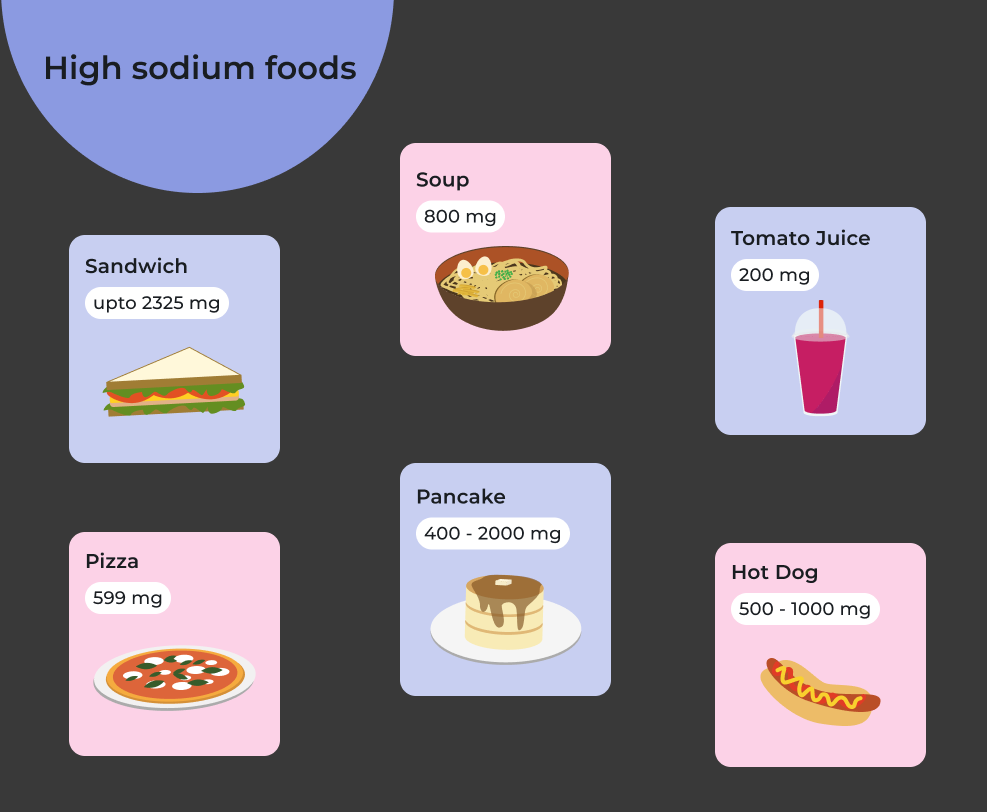
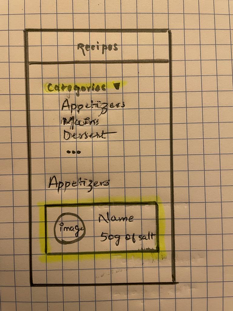
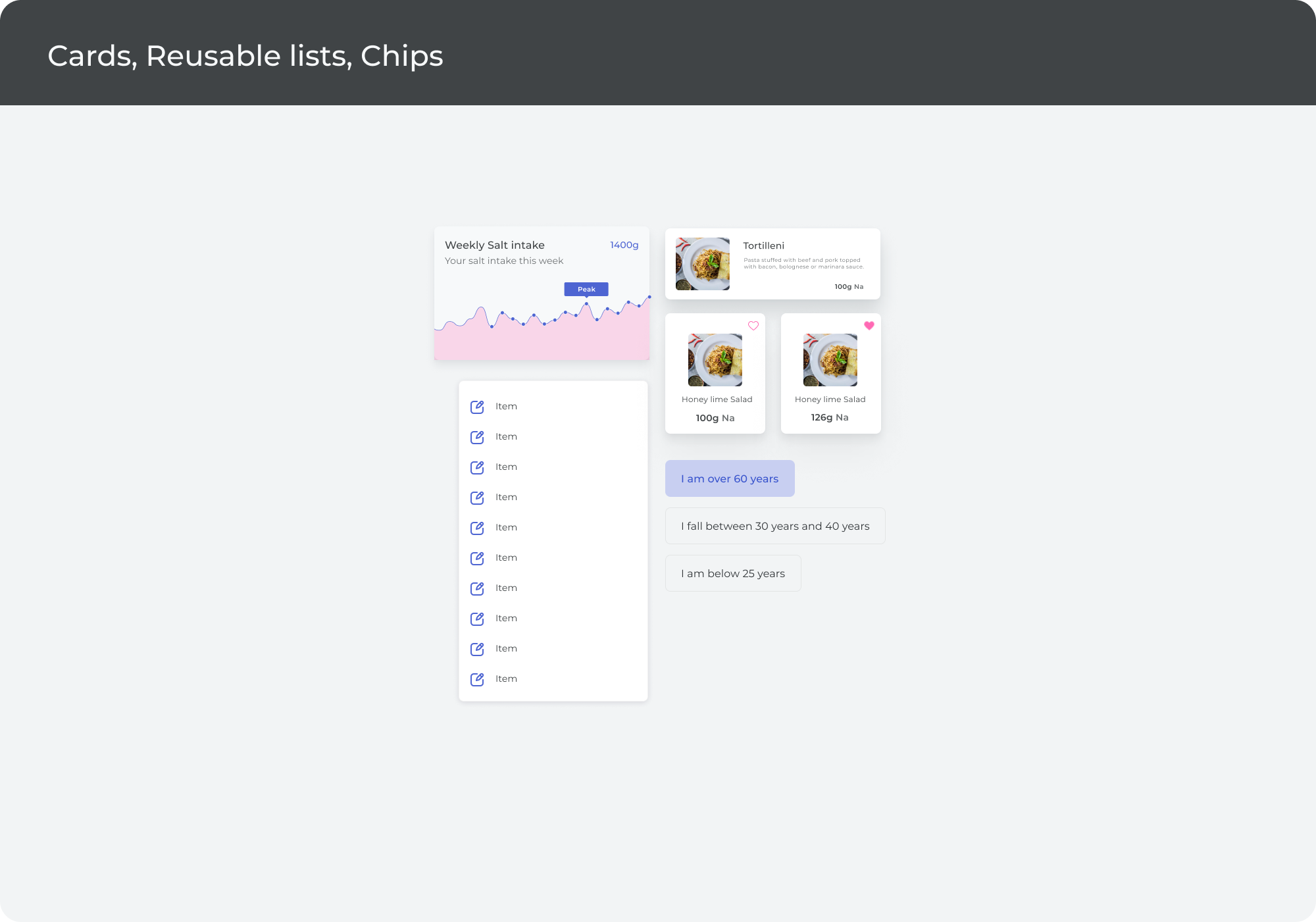
Recipes
They are low in sodium but high in flavor.
| My Role | Time | Category | Tools & Methods |
|---|---|---|---|
| UX Designer | 2 months | Mobile App | User Interviews, Design Thinking, Adobe Creative Suite, Figma, Miro, Google Meet |
The purpose of this study was to collect research data from doctors and patients with high blood pressure and cholesterol regarding their daily challenges managing sodium intake. Once the challenges were identified, the goal was to help address those challenges using technology after an examination of existing solutions in the market.
They are low in sodium but high in flavor.
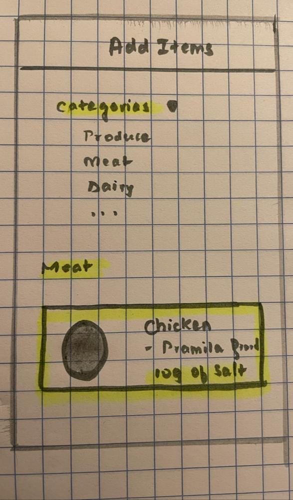
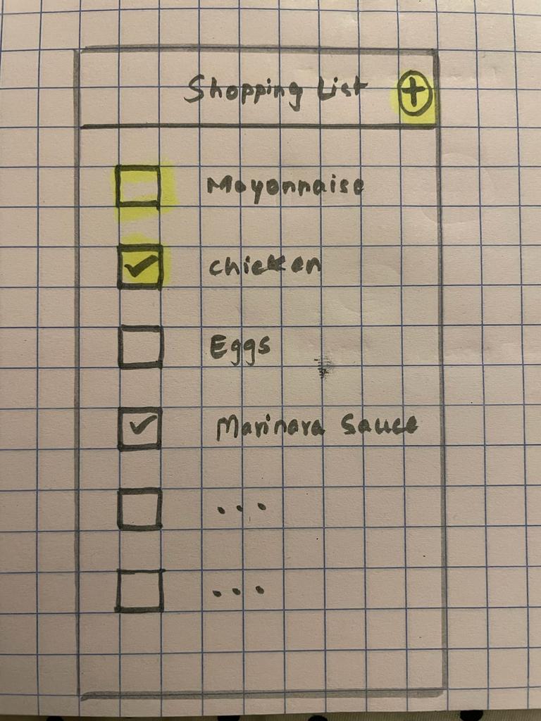
Check the market and create shopping lists that have low salt.
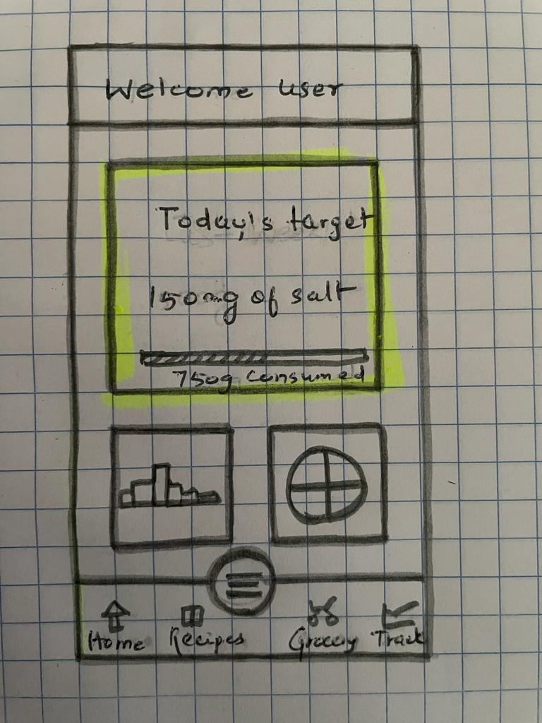
Monitor your salt intake daily.
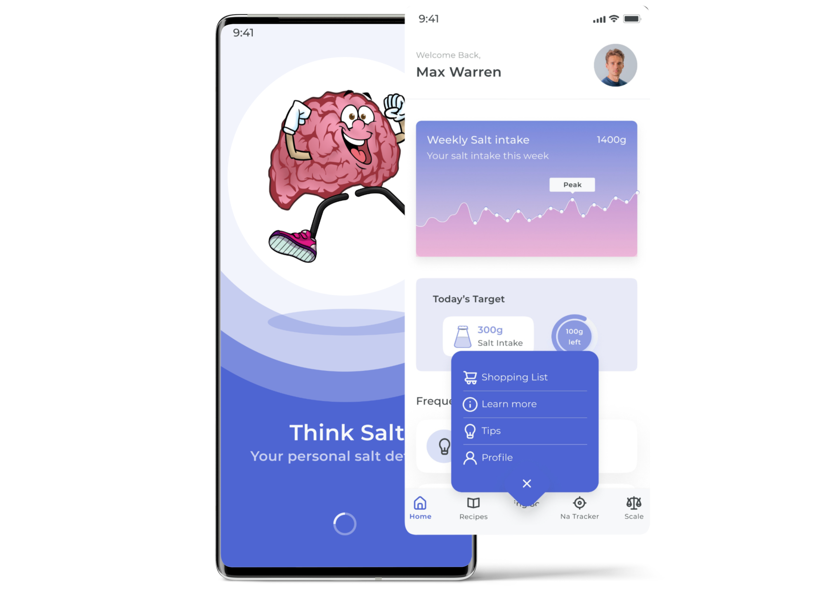
Get daily tips for living a healthier, less salty lifestyle.
Learn more about required salt intake per day and the effects of salt on the human body.
Easily measure salt wherever you are.
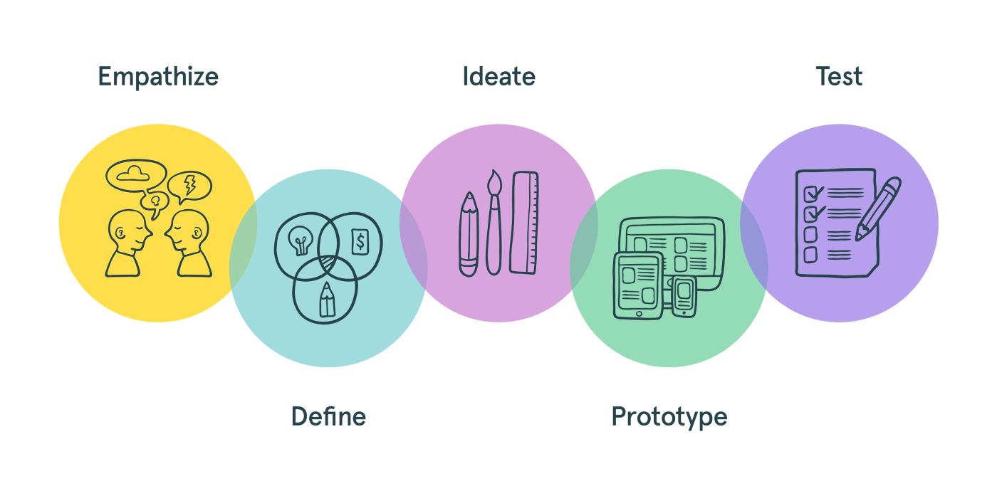
I chose to follow the design thinking methodology for this project. It helped me untangle ambiguity, validate ideas, and structure complex problems. The process includes gathering insights about the users, prototyping ideas, and validating them.
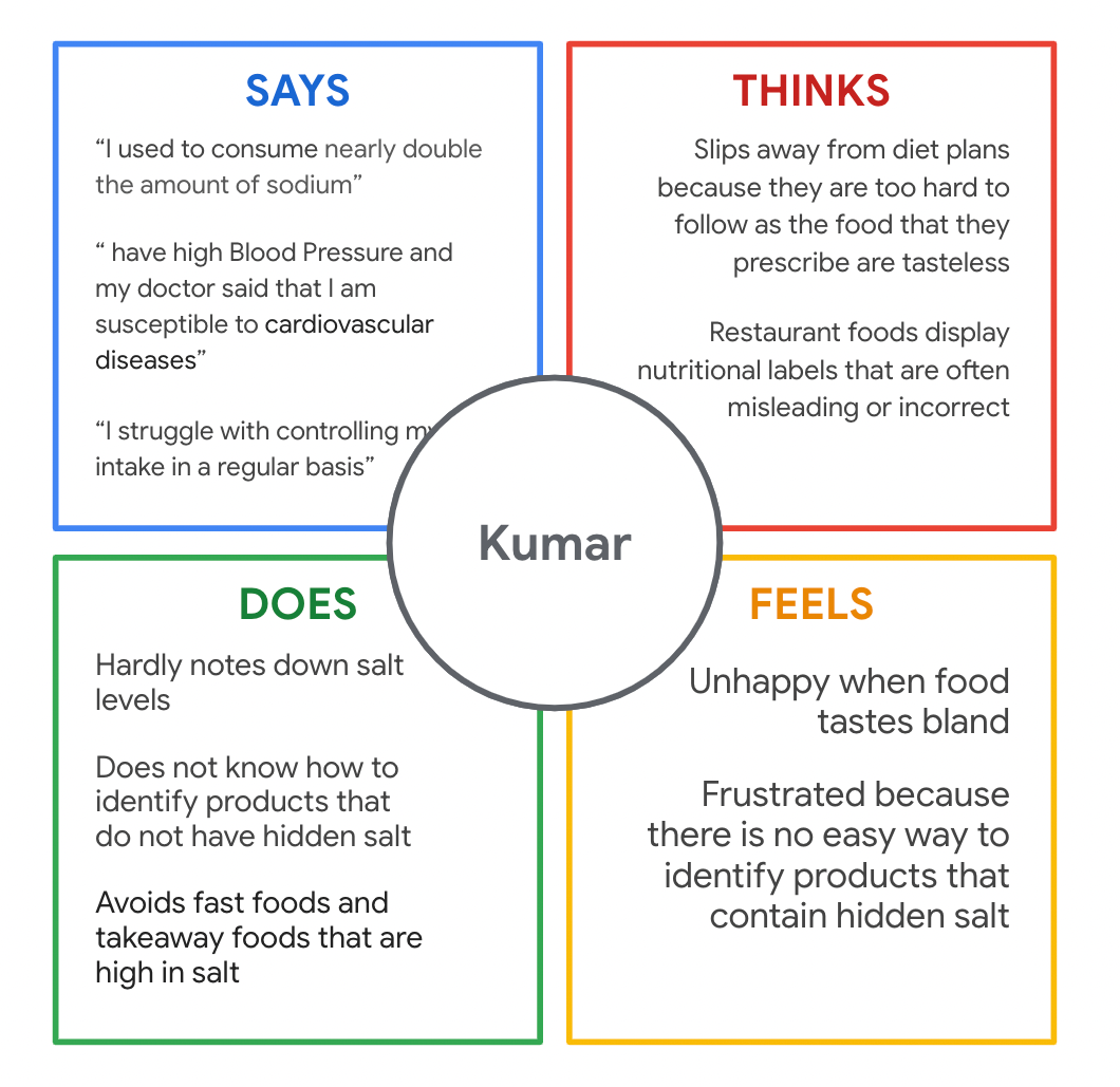
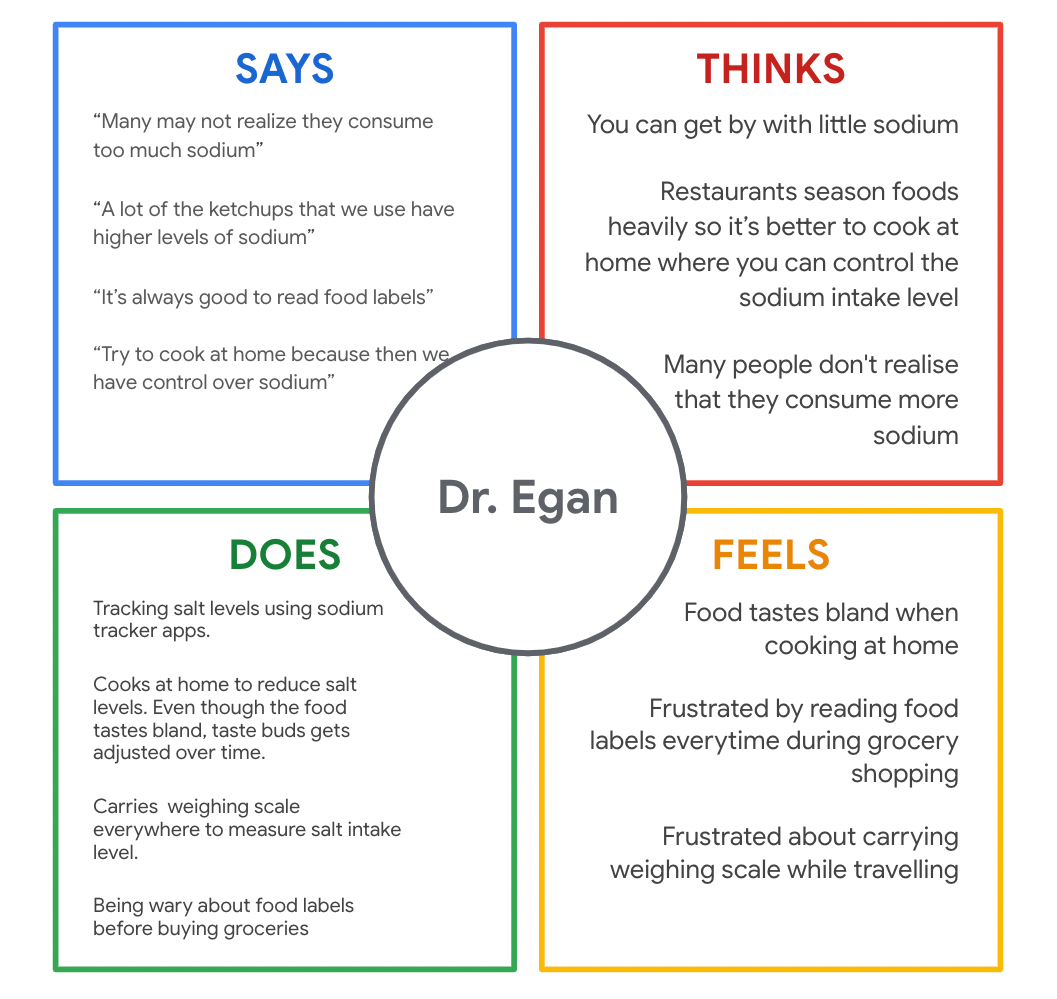
To understand people's needs to control sodium, I interviewed some targeted people. The results show a need to control sodium intake, but the current approach is often cumbersome and unpleasant.
The Cone of Possibilities is a tool that is typically used in foresight and future studies. It helps in depicting the idea that there are many future possibilities. It's an easy way of visualizing how we can examine many different futures to understand how to make better decisions in the present. There are four parts to the cone of possibilities. The apex is today. Our past stretches out behind us, further to the left. The most oversized cone represents all potential future options, everything that could happen.
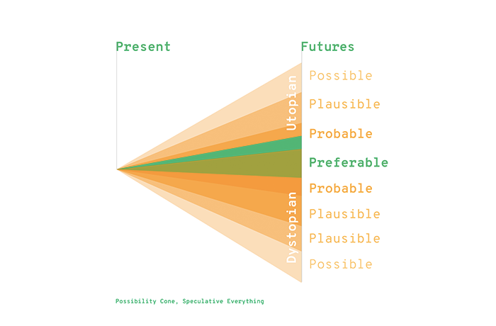
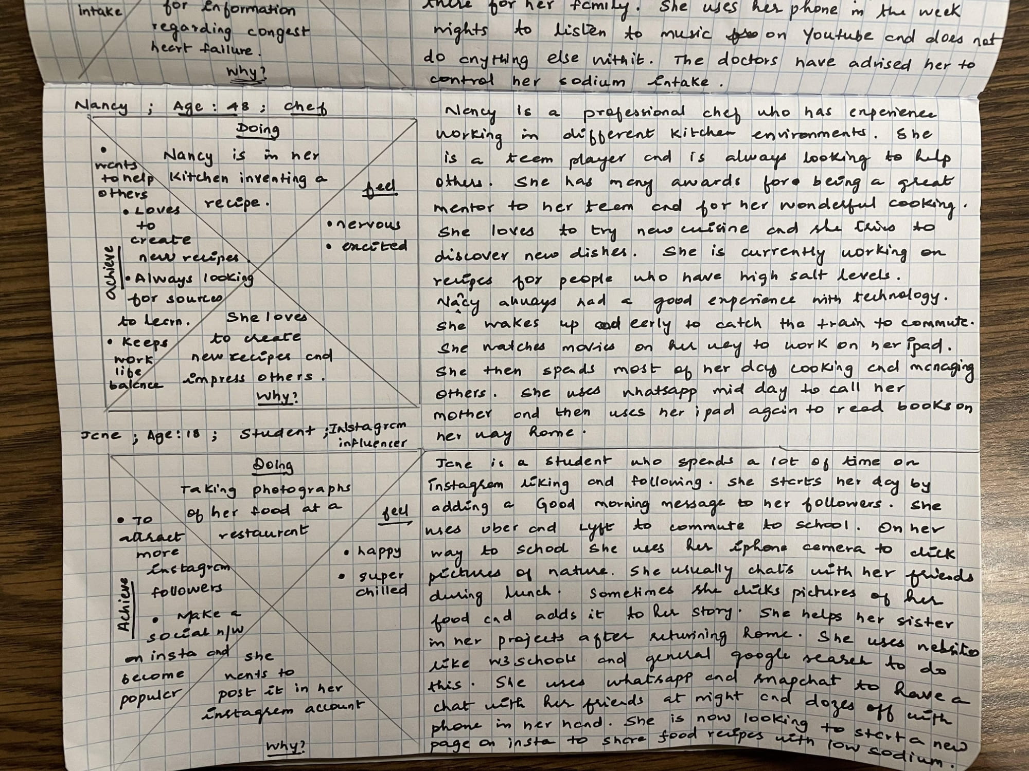
Using the empathy maps drawn after research, I created a user persona of a targeted user. I also used the Cone of Possibility technique to flesh out more users.
- Dr. Egan
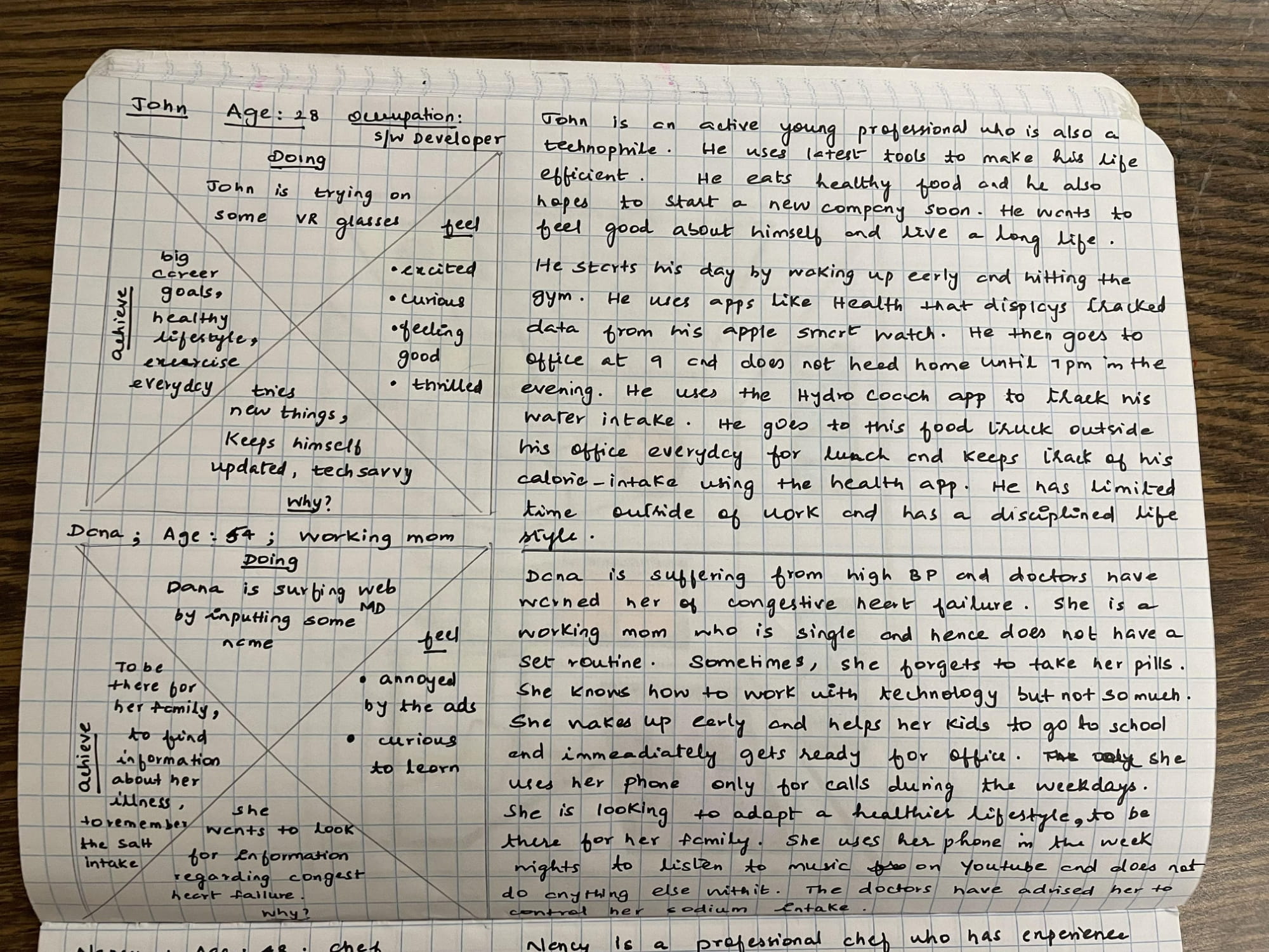
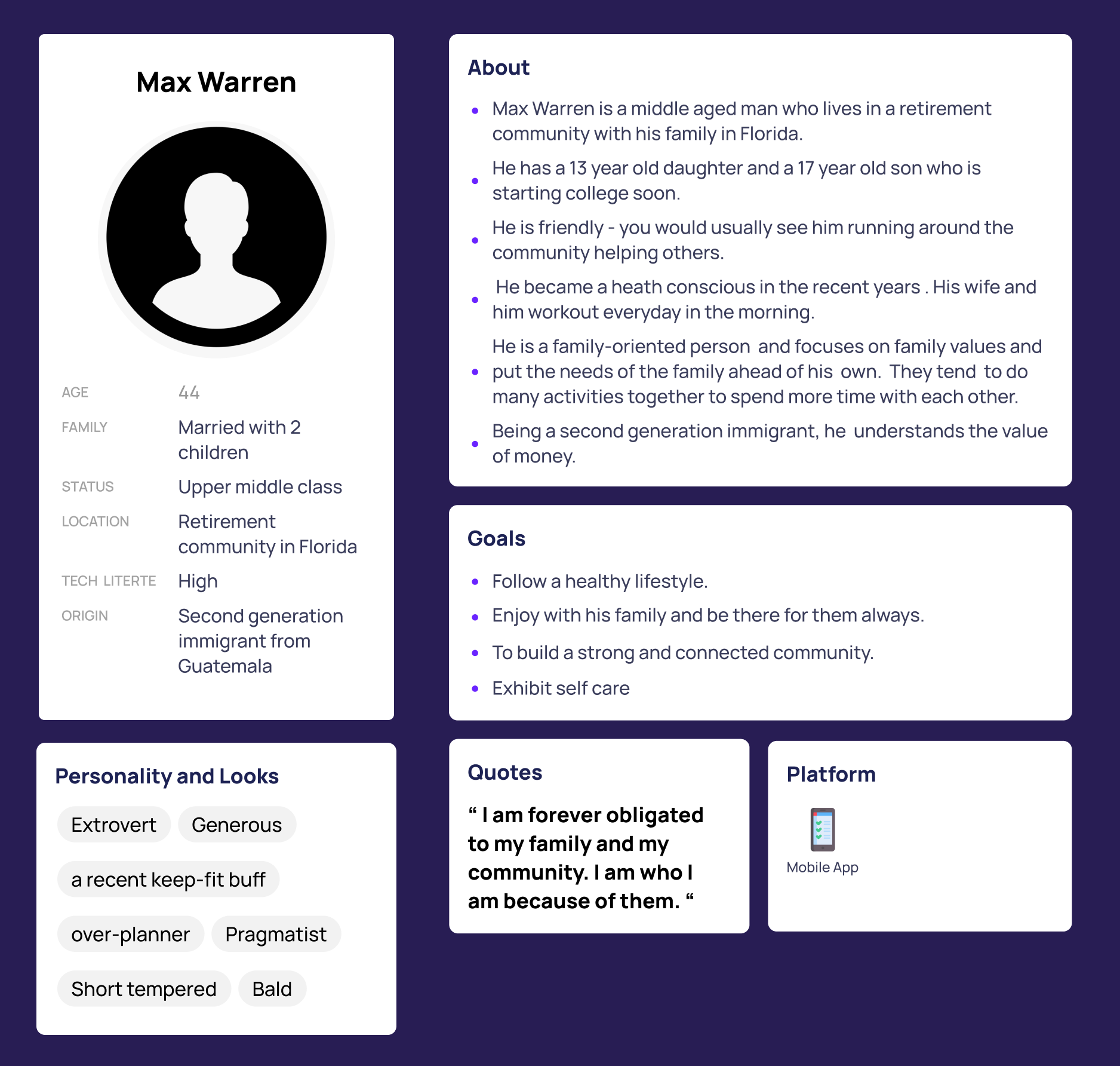
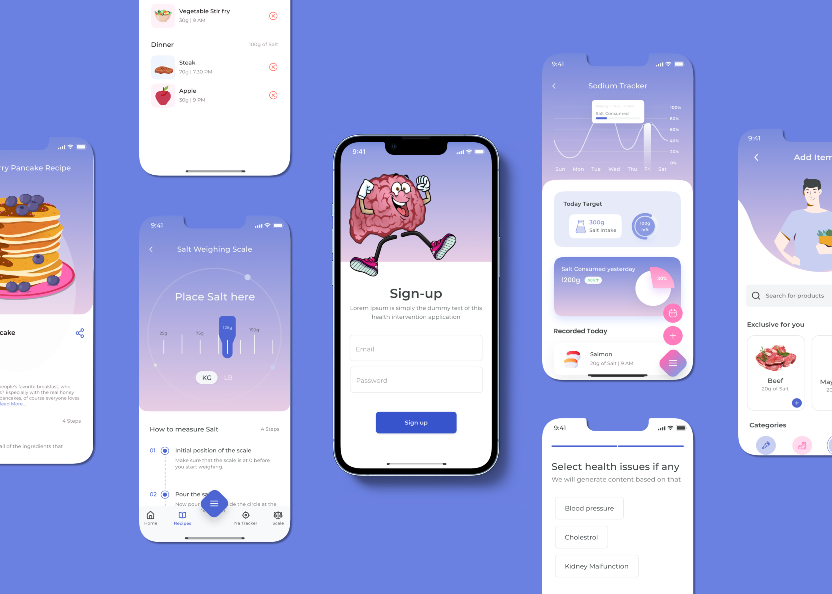
The first step was to gather user research which I completed using empathy maps, and I created a handy user persona from that. Max Warren is a businessman who aims to lead a healthier lifestyle with his family by controlling his salt intake.
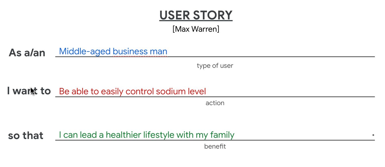
I learned that each user story includes a hero, a goal, and a conflict. Using that formula and the research I collected from the user persona, Max Warren, and I framed their user story. By identifying pain points for the user with the user story, I will be able to create a design tailored to users’ needs. The result is a great user experience.
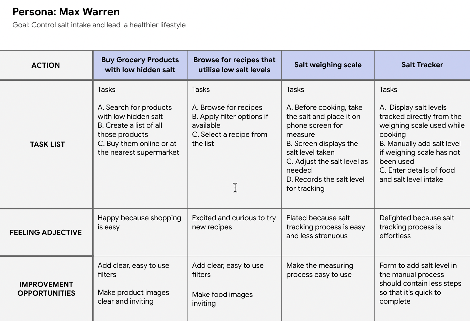
Now, let's walk through the steps for the user journey for Max Warren's journey with the Think Salt app. Finally, I also included opportunities for improvement. What are some ways that I can solve an issue or make a task more straightforward for the user? For example, I discovered an opportunity for improvement that I found in other sodium tracker apps. Those apps used a laborious process for the salt track.
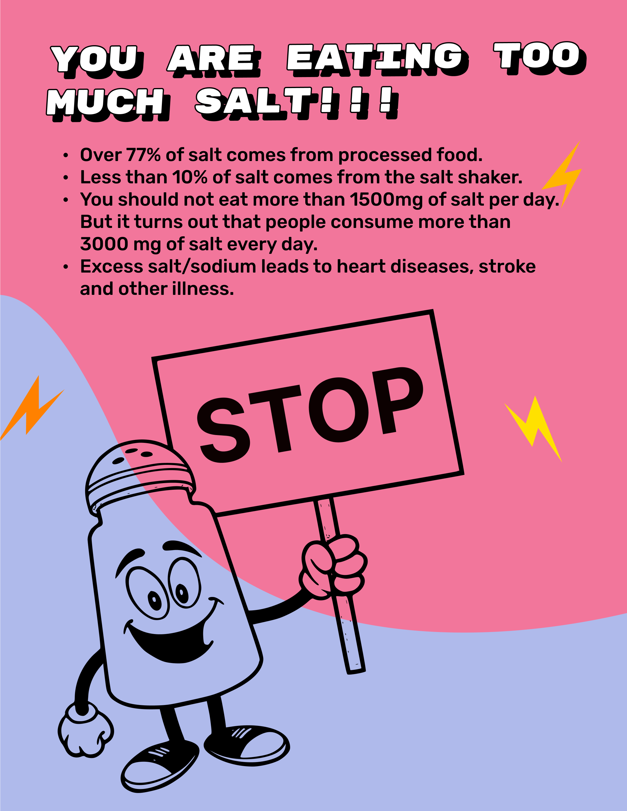
The human body needs a small quantity of salt to function, but most consume too much sodium. High sodium consumption can raise blood pressure, a significant risk factor for heart disease and stroke. Most of my family members suffer from high blood pressure, and heart issue runs in our genetics because of high salt intake. WHO says that we take too much sodium every day, so we all need a low sodium healthy diet.
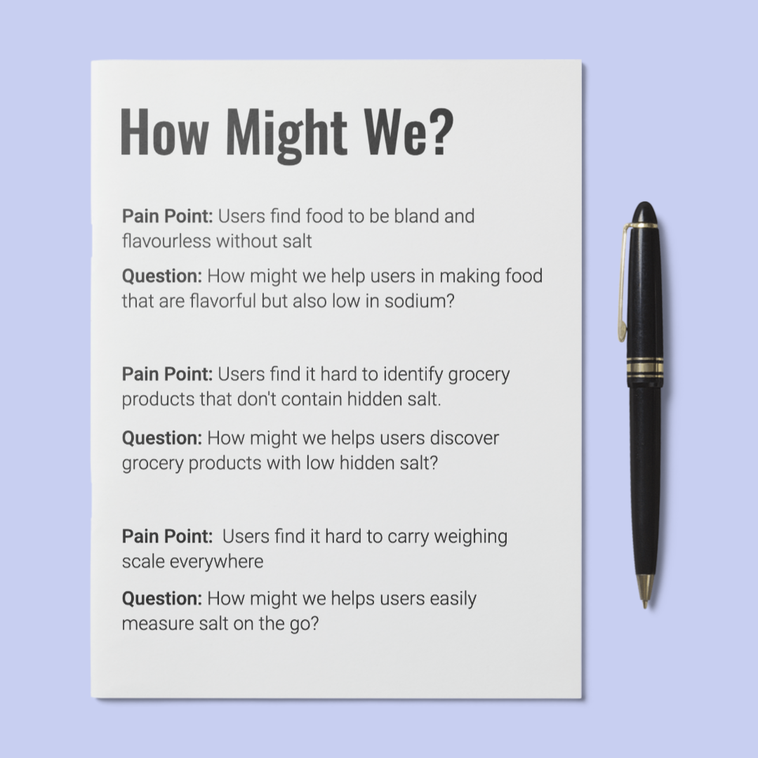
I generated ideas using the How Might We framework to help me generate many ideas I can choose from to help solve users’ problems. The goal of this activity is to come up with many possible design ideas. Some will be usable, and some won’t, but this process gave me a better idea of what might work.
I took the user’s pain points learned from the user research studies. Then I used this list from the Stanford d.school to begin generating ideas by asking how we might: Amp up the good. Change a status quo? Break the point-of-view into pieces.
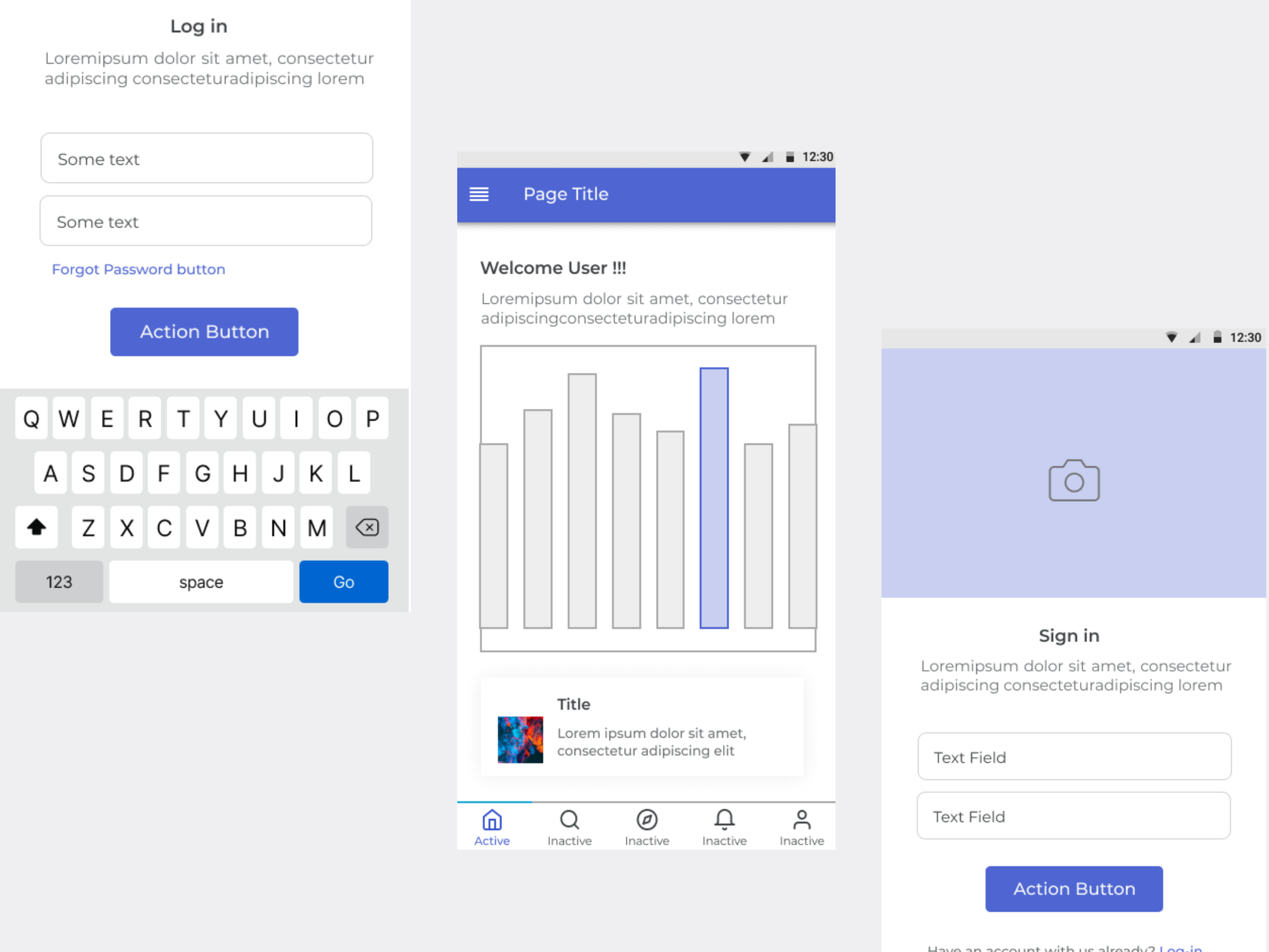
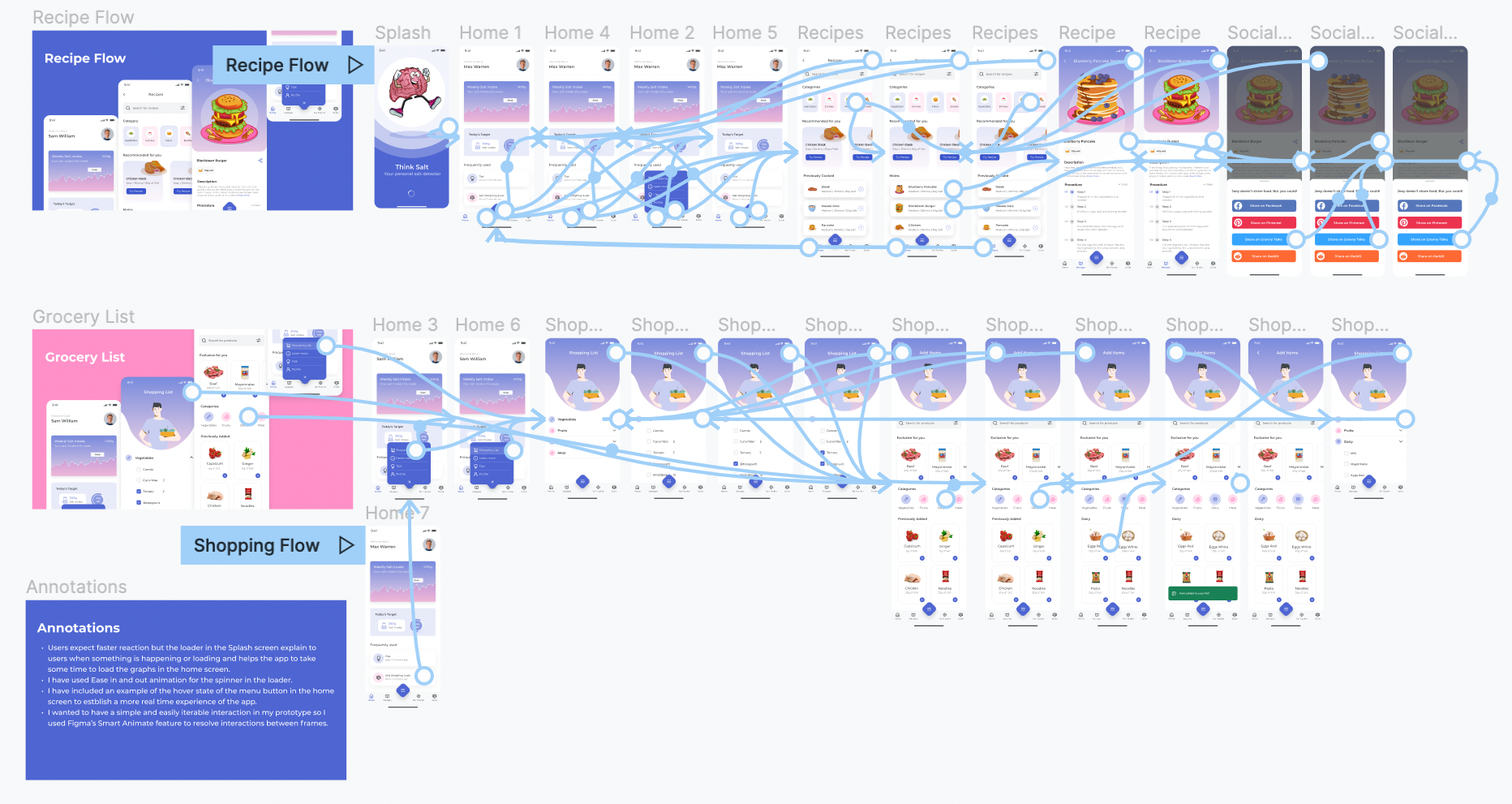
Sitemaps help outline the pages of the app you need to design and can help you spot necessary pages that you’ve forgotten to include, need to remove, or need to combine. A hierarchical sitemap outlines the relationship between pages in order of importance.
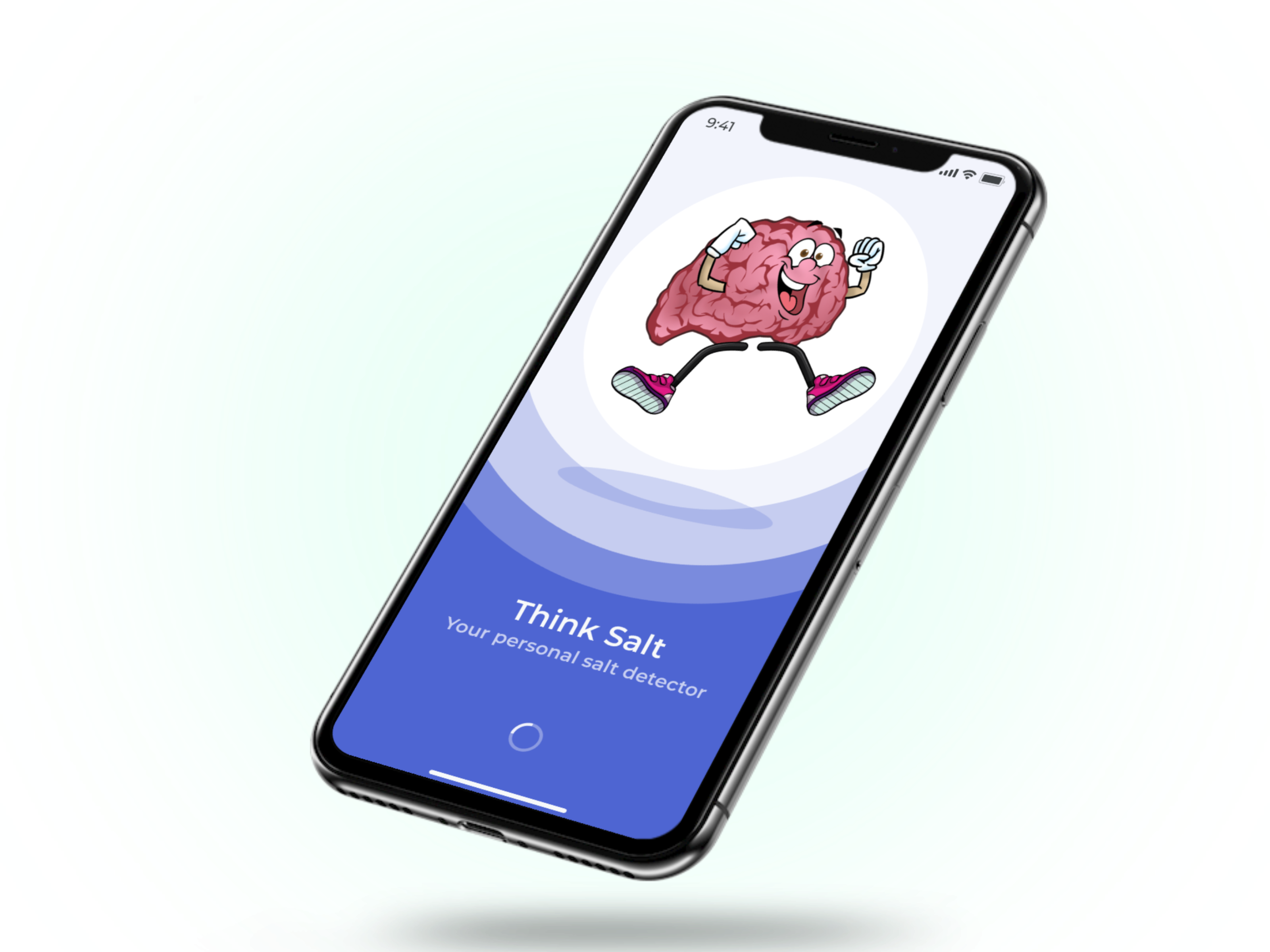
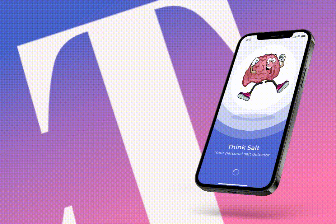
The main character illustration of the Think Salt app is the brain. My idea for the splash screen was to have an image of a cartoon brain dancing in joy. This portrays the effect this app would have on people, which depicts a healthier and more energetic lifestyle.
Think Salt helped me understand how tough it can be to know nothing about the project's field. For example, I had very little knowledge about Salt and the kind of implications it causes to the human body, which became tricky when designing the first few screens. So, instead of making blind assumptions, I did a lot of internet research about the implications of Salt. As a result, I could pull many user-researched data online that showed the inconsistencies in the existing solutions. This made me realize just how important it is to know about the app you are developing to create a well-rounded user experience.